GUIDE 08 / Color / Delivery
Why Do My Photos Look Different on My Phone? A Color Management Workflow for Photographers
Learn a practical photo color management workflow for consistent skin tones and color across Lightroom, phones, web galleries, social media, and print.

You finish a portrait on your computer. Skin looks rich without going orange. The blacks are clean. The background color lands exactly where you want it.
Then you open the same photograph on your phone and suddenly it feels warmer, brighter, flatter—or just different.
That does not automatically mean the edit is bad. The photograph has entered a chain of different displays, color spaces, profiles, brightness levels, apps, and export settings.
A strong photo color management workflow is less about making every screen identical—because you cannot control every screen—and more about removing avoidable surprises before a client sees the gallery.
At Flicks by Ed Media, skin tone is part of the photograph. The goal is color that stays intentional from edit to delivery.
01 / Start with the screen you actually edit on
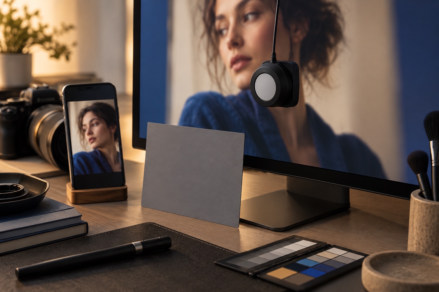
If your editing display is misleading you, every correction after that is built on a shaky reference. Adobe recommends calibrating and profiling the monitor to help Lightroom Classic display color reliably and consistently.
Let the display warm up before a critical color session. Avoid editing with the screen at an unrealistically high brightness. Keep room lighting reasonably consistent, and recalibrate on a regular schedule if you use calibration hardware. Judge skin with your eyes, histogram, and known references—not only one saturated screen.
GEAR / Same portrait, two reference screens
Use the visual break to compare the delivery decision with the photograph, not with the effect.
02 / Understand why color spaces matter
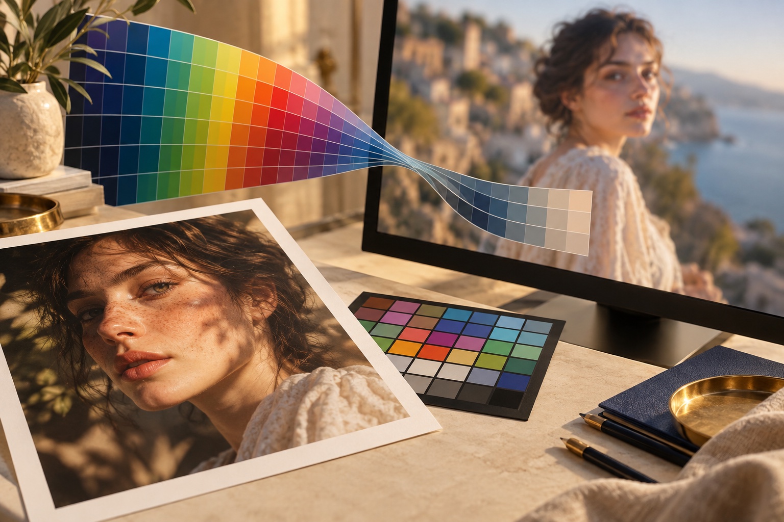
A color space describes a range of colors. Different spaces can contain different gamuts, and the destination matters.
Adobe documents that Lightroom Classic uses a wide-gamut working environment in Develop and allows photographers to choose a color space when exporting. Current export choices include sRGB, Adobe RGB, ProPhoto RGB, and supported HDR spaces depending on the format and workflow.
The key is not “largest color space wins.” The key is choosing an output that fits where the photograph is going.
For ordinary web and client-sharing workflows, sRGB remains the safest compatibility-first default. Adobe specifically gives sRGB as an example for photos shared online. For controlled print, the printer, paper, and ICC profile become part of the chain.
TECHNIQUE / Editing space to final display
Use the visual break to compare the delivery decision with the photograph, not with the effect.
03 / Get skin right before you chase a look
A preset is not a skin-tone strategy.
Before pushing teal shadows, warm highlights, film curves, or a heavy color grade, establish believable skin. Check exposure, white balance, mixed-light contamination, and whether a colored wall, LED, grass, neon sign, or sunset is influencing the person.
For darker skin especially, preserving dimension matters. Raising everything until the face is technically bright can flatten shape and kill the lighting that made the portrait work.
Ask: Does the skin still have depth? Are highlights holding texture? Did the grade push reds or oranges too far? Do the face, neck, hands, and body feel like they belong under the same light? Once the person feels right, build the look around them.
04 / Separate correction from the grade
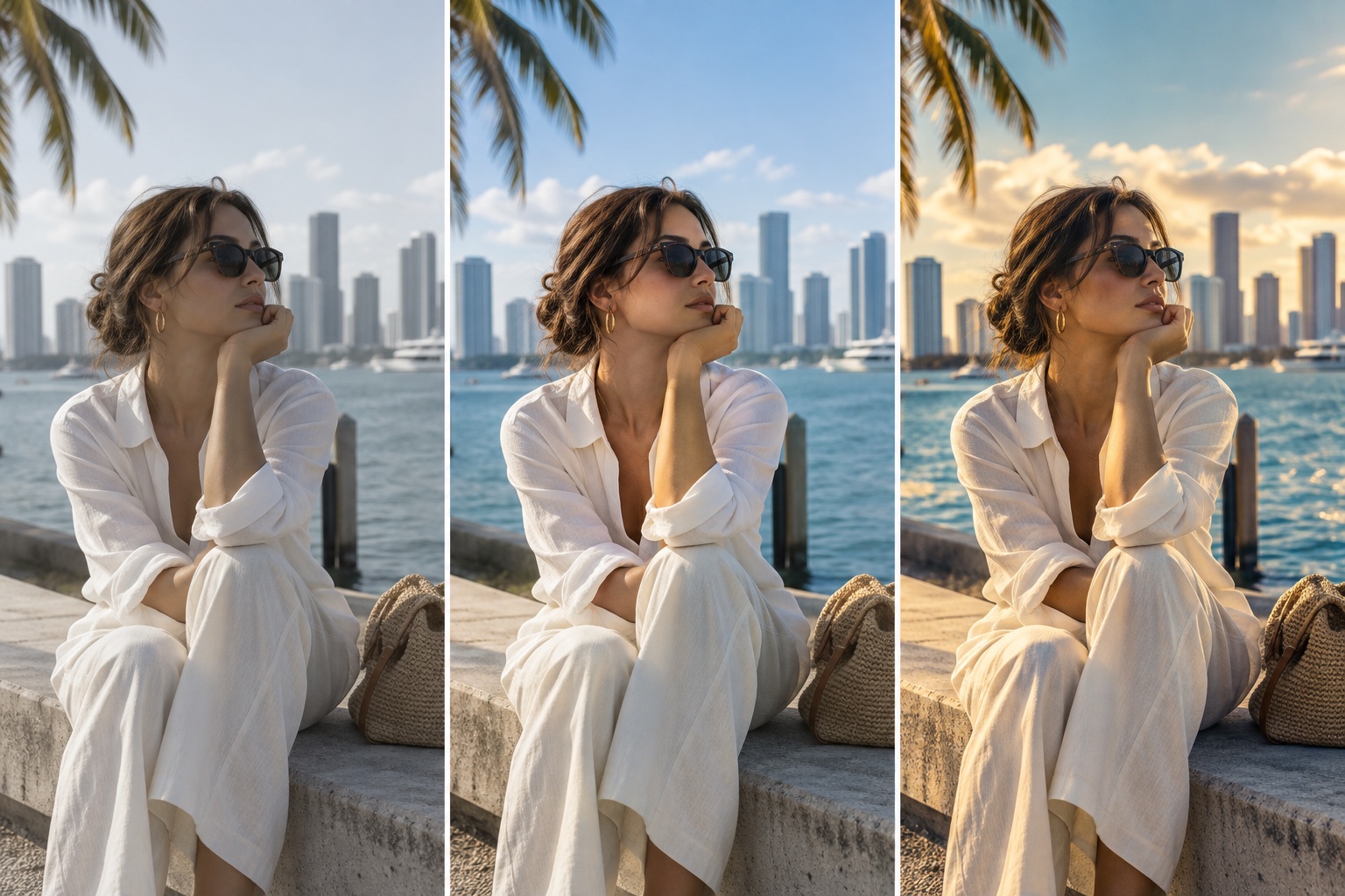
One of the easiest ways to make color harder than it needs to be is trying to correct and stylize at the same time.
Correction gets the photograph into a believable place: exposure, white balance, neutral relationships, skin consistency, and problem colors.
The grade creates the feeling: warmer nostalgia, cooler editorial shadows, muted color, punchier nightlife, cinematic contrast, or whatever the project actually needs.
This makes it easier to diagnose a problem. If a client's skin looks strange, you know whether the issue came from the correction or the creative grade.
LOOK / Raw, corrected, final grade
Use the visual break to compare the delivery decision with the photograph, not with the effect.
05 / Build one master frame before syncing a gallery
For a portrait set shot under consistent light, choose one strong representative frame and finish it carefully. That becomes your master reference.
Synchronize appropriate adjustments across nearby images, then inspect them individually. Do not assume the same white balance or mask is perfect just because the photographs were taken seconds apart.
At an event, this matters even more. You can move from window light to tungsten to magenta LEDs to direct flash in one room. The workflow should create consistency without pretending every lighting condition was identical.
06 / Export for the destination
Lightroom Classic lets you choose file format, quality, color space, dimensions, resolution, and other output settings. For a standard online portrait gallery, a useful baseline is:
- JPEG
- sRGB
- sensible high quality
- dimensions appropriate for delivery
- output sharpening chosen for screen use
Do not confuse PPI with the actual pixel dimensions a website or client receives. For screen delivery, pixel dimensions and file handling matter far more than typing a magical “300 DPI” number into every export.
For print, build a separate export and ask the lab what profile, file type, dimensions, and sharpening they recommend.
TECHNIQUE / Web delivery versus print

Use the visual break to compare the delivery decision with the photograph, not with the effect.
07 / Soft-proof when print is the destination
A print is not a glowing screen. Paper, ink, printer gamut, and viewing conditions change what the image can reproduce.
Lightroom Classic Soft Proofing lets you preview how color translates under selected output conditions. Adobe recommends using the same ICC profile for printing that was used while soft-proofing for a specific printer and paper combination.
This is where saturated colors can expose themselves. A vivid blue, cyan, red, or neon tone that looks easy on a display may not map cleanly to a particular print process. Soft proofing gives you a chance to make a proof-specific adjustment instead of discovering the problem after the print arrives.
08 / Do a real-world device check—without editing by committee
After export, check a few finished images on another mainstream device or browser. This is quality control, not an invitation to redo the photograph every time two screens disagree slightly.
Look for major problems: aggressively orange or magenta skin, crushed blacks, clipped highlights, dramatic desaturation, the wrong export profile, or a platform crop or compression change.
If the image looks reasonable across your controlled edit display and a normal secondary device, ship it.
Trying to make one photograph look mathematically identical on every phone in Miami will have you editing until the Dolphins win three Super Bowls in a row.
09 / HDR is powerful—but know the delivery chain
HDR photo workflows can display brighter highlights and more dynamic range on compatible HDR displays. Current Lightroom Classic documentation supports HDR editing and export, including HDR-enabled sRGB, P3, and Rec. 2020 spaces.
That does not mean every client gallery should become HDR. The viewer needs compatible hardware and software. If predictable cross-device delivery is the priority, SDR remains the simpler baseline. Use HDR because the project benefits from it—not because the checkbox exists.
LOOK / SDR and HDR as a delivery decision

Use the visual break to compare the delivery decision with the photograph, not with the effect.
10 / Run the Flicks color check
Before a gallery leaves the studio, ask:
- Is the editing display trustworthy?
- Does white balance make sense for the scene?
- Are skin tones believable and dimensional?
- Did the creative grade preserve the person?
- Are neighboring frames consistent?
- Is the export color space right for the destination?
- Did you check exported files outside Lightroom?
- Does print need a dedicated soft-proof and lab profile?
- If using HDR, is the delivery environment compatible?
The point is protecting the photograph from capture to client.
Photo color management workflow FAQ
Why do photos look different on my phone?
Phones, monitors, browsers, apps, brightness settings, and color profiles can all display the same file differently. A calibrated editing display and a properly tagged sRGB web export remove the most avoidable surprises.
Should photographers export sRGB for the web?
For ordinary online galleries, social sharing, and client delivery, sRGB is the safest compatibility-first choice. Use a separate print export when a lab or printer supplies a different profile.
Do I need to calibrate my monitor for photography?
Calibration and profiling make the editing display a more trustworthy reference. They cannot make every client screen match, but they help prevent you from correcting around a display that is already misleading you.
What is soft proofing in Lightroom?
Soft proofing previews how color may translate under a selected output profile, such as a printer-and-paper combination. It helps you make a proof-specific adjustment before sending the file to print.
Should every photo workflow use HDR?
No. HDR can be useful when the project and audience support it, but SDR remains the simpler baseline when predictable delivery across devices matters most.
Final take
Color management sounds like one of those topics photographers avoid until a client says, “Why does this look different on my phone?”
The fix is not one secret Lightroom slider. It is a chain: trustworthy display, intentional correction, controlled grading, destination-aware export, and a final real-world check.
Get that chain right and your photographs have a much better chance of keeping the skin, mood, and color you worked for. At Flicks by Ed Media, the edit should feel finished—not fragile. You bring the vision. I’ll create the moment.
Keep building the portrait
Connect the edit to the rest of the shoot: start with One Light, Expensive Look, use Cinematic Video With One Camera for motion coverage, read the Lightroom masking workflow, and bring the finished idea to portrait and video services.